
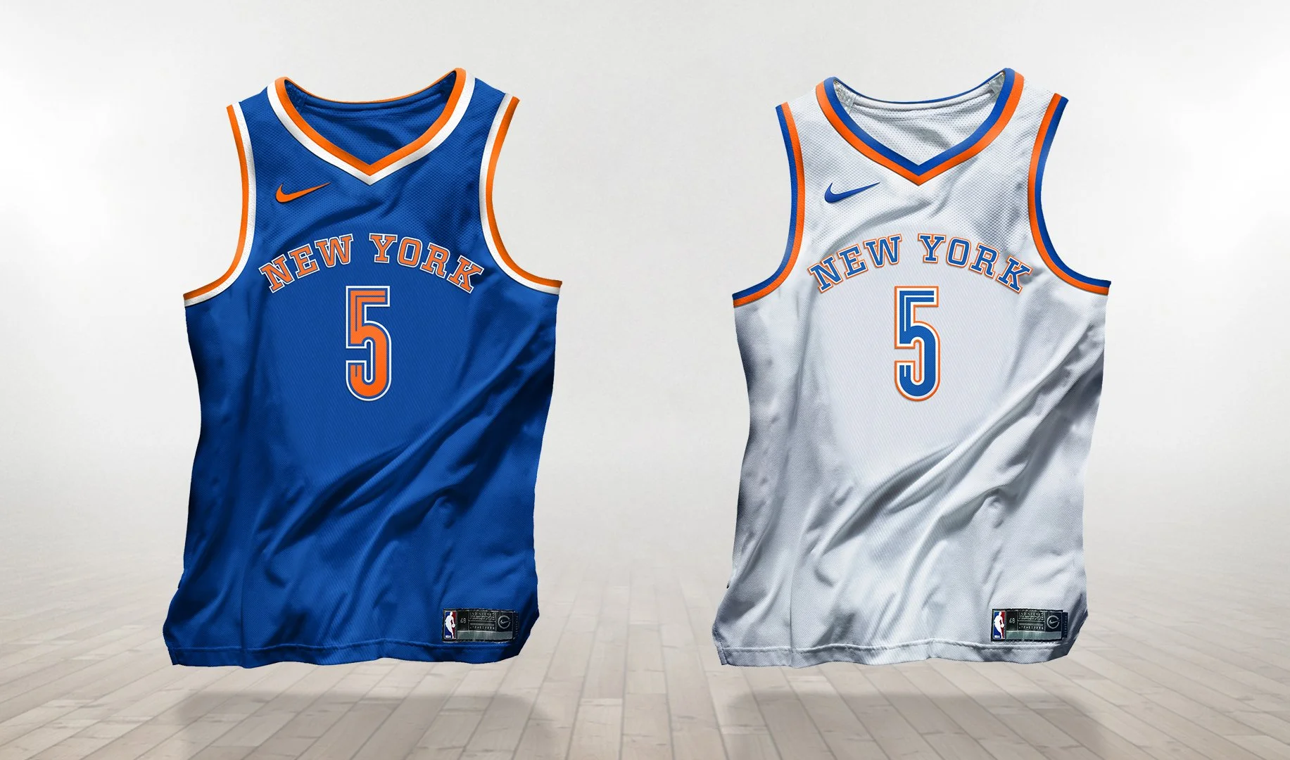


The New York Knicks are a nostalgic symbol in sports history. Walt Frazier, Patrick Ewing, and Carmelo Anthony have all etched their names as 'Knick Greats' and have been at the center of many NBA rivalries. In recent times, the team has been in a slump and, as a result, both ticket sales and appeal have been poor. Whereas this would signal a complete destruction for most franchises, fans continue to hold out hope for turning a corner. This rebrand is aimed to reignite the energy, love, and fandom of New York City.
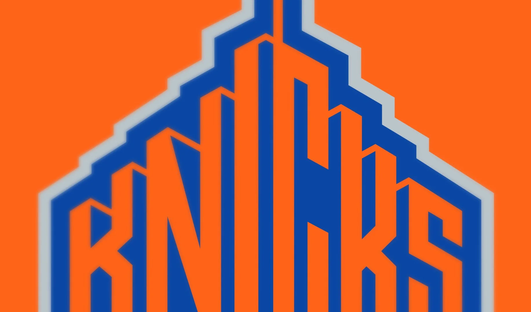
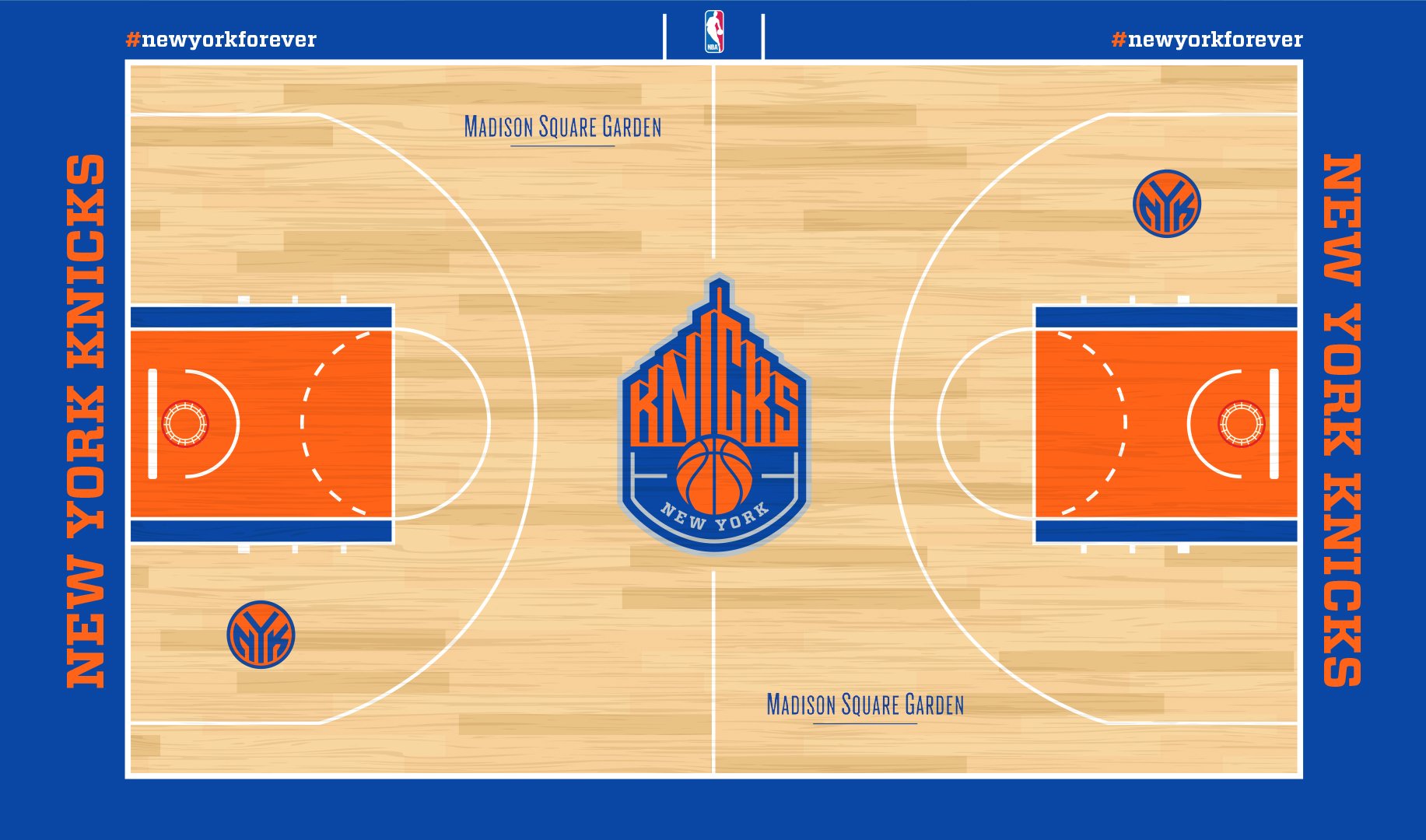
Creatively, I have always respected this mark and the combination of its basic shapes. The overall design of the 'Knicks' logotype sitting atop the basketball had first debuted in 1964. Since then, the styles have changed, but the foundation remained the same. Aside from color shifts and minor details, the current mark has not been fundamentally changed since 1992. The new identity keeps the structure and integrity of the existing logo, while reshaping all the details that make it unique. The main focus of the rebrand was to introduce the city skyline, which is iconic to New York City. The two sides of the buildings converge in the center to create a 'larger than life' perspective of looking up at a massive skyscraper.